The Non-Photographic-Looking Ads
OK, I admit the title is weird and most probably grammatically incorrect, but you'll get what I mean when you read on. As I'm sure all of you magazine devotees have noticed, there are two ads this season that look more like fine art than photographs.
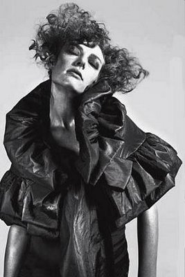
Firstly, there are the Moschino ads. Def not my favourite ads, (perhaps I'm just too dense to get the message and theme of the ads.) Don't these ads look like pencil sketches to you? At least they do to me, especially the second one.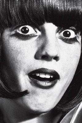
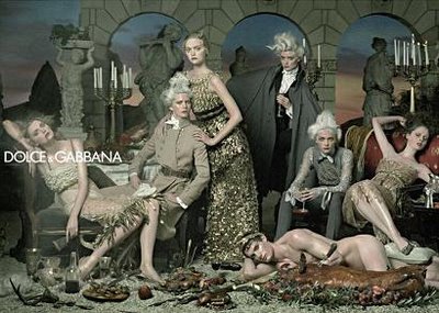
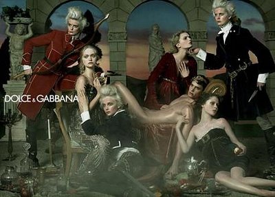
Secondly, there are the Dolce & Gabbana ads. Again, they're not my favourite ads this season, (the SS06 Dolce ads were waay prettier), but I certainly stared at them the longest of all the FW06 ads. Because if you look at all the images in one go on the Dolce website, you feel sort of like you're walking in a museum, looking at a set of paintings. All the (female) models are wearing gorgeous dresses, and some look rather... dead in the images.
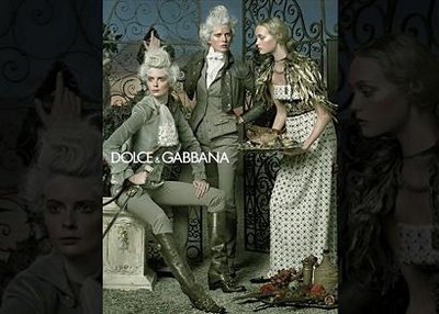
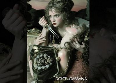 This girl is probably thinking, 'At least I'm going to die with my beloved Dolce & Gabbana handbag.'
Personally, I prefer advertisements to be clear and focused photographs. But it's always interesting to have variety. Do you like this kind of ads?
And yes, I do realise all these ads are actually photophraghs.
Firstly, there are the Moschino ads. Def not my favourite ads, (perhaps I'm just too dense to get the message and theme of the ads.) Don't these ads look like pencil sketches to you? At least they do to me, especially the second one.


Secondly, there are the Dolce & Gabbana ads. Again, they're not my favourite ads this season, (the SS06 Dolce ads were waay prettier), but I certainly stared at them the longest of all the FW06 ads. Because if you look at all the images in one go on the Dolce website, you feel sort of like you're walking in a museum, looking at a set of paintings. All the (female) models are wearing gorgeous dresses, and some look rather... dead in the images.


 This girl is probably thinking, 'At least I'm going to die with my beloved Dolce & Gabbana handbag.'
 Personally, I prefer advertisements to be clear and focused photographs. But it's always interesting to have variety. Do you like this kind of ads?
And yes, I do realise all these ads are actually photophraghs.


28 Comments:
theyre definetly unique. great blog!
whoah i spelled that wrong.
I love the Dolce & Gabbana ads... they look so pretty, like a painting, and have lovly clothes.
:o i'm kind of suprised to find that you don't like them.
the Moschino and Dolce&Gabbana ads have been my favorrriiitee this season. i lovee the artsy feel of the ads,
i love the dolce ads!!!
they're fun, provocative, and much more creative than a lot of the stuff out there!!!
colormechic.blogspot.com
I really don't like the Moschino ads ... but maybe thats just I don't really like the brand in general ...
I LOVE the D&G ads ... everything always fits together so nicely, its like an explosion of fashion. And they're quite classy too ... The S/S ones were a bit better, just simply because they were so bright and cheerful ... but these ones are great too :)
both of those ad campaigns have a place on my wall of magazine cutouts. :D
i really like the concepts.
Speaking of non-photographic ads, have you seen the Jil Sander ads, where the photographs look exactly like pencil etchings?
i think the ads are cute, if i'm not mistaken gemma seems to be in the ads. I saw a video about how she got started in the business, and how weird that modeling never even crossed her mind. Her friends were the ones that nagged her to go in a competition. It was fate.
its so funny i was just posting about the dolce ads the other day.. i've been using the 3rd one as my laptop's wallpaper for a few months now. i chanced upon these beautiful wallpapers when i was googling for gemma's pics online. i love them that they resemble the paintings from the 18th century. the sense of decadence... ooooh i just cant get enough of them hehe :P
La Voguette
http://sofysophia.blogspot.com/
The D&G ads are my Favorite!!!
Their so different from anything else out there....
P:S
I LOVE your blog!!!
Read it ALL the time!!
~Mal <3
no. i don't like the d&g ads.
they scream insecurity hidden behind a "hipper than thou" attitude.
dolce & gabbana is(are?) trying too hard.
if those ads were made by a young fashion company who didn't have a reputation and needed attention, i could appreciate this baroque on acid advertising.
i like this sort of ads cos it realli show the skill of the photograhpy...
ur blog is good keep it up!
those moschino ads, were, well, ugly. at least for my very untrained eye.
however, i do like the d&g ones. they're different in a good kind of way.
Cool pics!
i love the second moschino one. i love the look on her face, that sort of aloof model pose.
i like the dolce and gabbana ones too, remind me of marie antoinette, bc it's all about the pretty image, but behind the pretty image is this sort of not really glamorous life. although d&g might not be expressing that. i thought the movie was expressing that.
on second glance though i don't like them as much as i did a second ago. the moschino ones are somber looking, a tad depressive bc of the black and white. make me feel a tad suicidal. then cut to d&g and although it's pretty, everything looks over fabricated and setup, so even the drama of the knife doesn't really hit you. just seems kind of over done and not real. there's no humanity.
i guess i look for a certain youthfulness and color in ads. like teenvogue. but it still has to be fashionable and not tacky.
I think the D&G advertisments are really great; note how marketing industry has been taken one step further here - by citing the famous' Caravaggio paintings (who is indeed a remarkable painter). This is not only advertising, it is art, very high quality art implemented into ads with a twist and finely executed by modern techniques such as photography. Wonderful.
Speaking of Moschino "sketches" - they rather resemble very finely detailed pencil drawings, even if those photographs were just heavily adjusted digitally, it's still another elegant twist on the boring, cliché, flashy-dashy-dazzly-bright photograph advertisements found literally everywhere. The first image is a bit scary, though :P
Overall I think that both companies have done a very good job for these campaigns. We need more art and less ad, in my opinion.
These ads are not my favourite either, but they're remarkable because they're def different from 'common' fashion ads. In particular, I think the Dolce & Gabbana campaign echoes the paintings by Jacques-Louis David, one of the most famous neoclassical French painters (he portrayed even Napoleon!).
The first two are just plain scary. Kind of Clockwork Orange-ish. But I do like the Dolce & Gabana ads. I think they are fun and the clothing is gorgeous.
lovu lovu the D&G ads. They're so staged and elegant.
I LOVE the Moschino campaign!! I've cut out all of the ads and put them on my wall because they're so different and edgy in a pop arty way. Moschino ads have been my favorites from the beginning, they are always trying something new to catch the viewer and it works! On the other hand I find the D&G ads to be interesting but I think there is a little too much going on.
Bravo for Moschino for trying to do something totally different from the usually fluffy and glossed over images. But they failed. The market isn't ready for this kind of artistic expression.
As for Dolce and Gabbana. I can respect them because they're very well shot and composed. I do understand why they were infused with a canvas layer during the retouching process. But it doesn't translate well into a normal magazine. In a gallery printed on actual canvas is where these babies belong.
I think more ads should take larger risks next season [well I guess f|w 07 since spring ads are out now.] But they should do so without trying to completely push the standard accepted image like Moschino.
I just love them... Dolce and Gabbana now is keeping things sizzling hot with new denim styles as we transition into the height of spring/summer fashion.
one of my favorite campaigns.
I never go to my doctor anymore asking for pain killers prescription and then be turned down at the end, all I do is order online from www.medsheaven.com hassle free and low cost, they have three pain killers listed on their website which are ultram tramadol celebrex that you buy, and the best part is no prescription required!!!
This cannot really work, I feel so.
full version games | online games | pacman pc games | social games | full version games online free
kd shoes
dior glasses
longchamp
fitflops
off white hoodie
nike air force 1
prada sunglasses
jordan 11 retro
adidas stan smith
ray ban aviator sunglasses
Post a Comment
<< Home